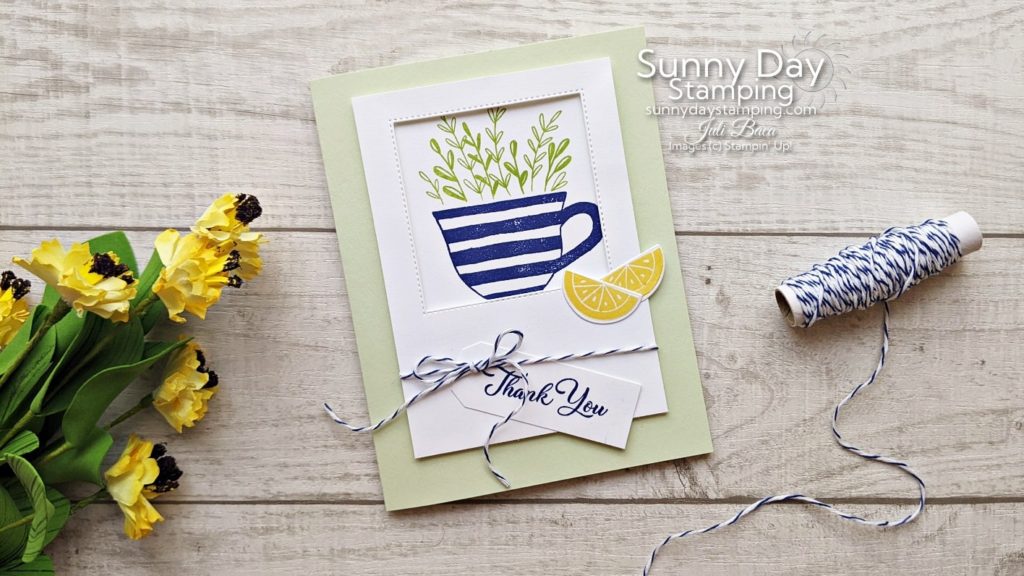
What’s one great tip for making your cards more interesting? I’ll show you with lots of examples, so you can use this tip in your own card making!
Cutting and Scoring Measurements:
• Card Base (Soft Seafoam): 8 1/2” x 5 1/2” (scored at 4 1/4” and folded)
• Window Layer (Basic White THICK for stability): 3 ¼” x 4 ½
• Square for inside window (Basic White): 2 ¾” x 2 ¾” or use largest square die from Stylish Shapes
• Sentiment Layer (Basic White): scrap
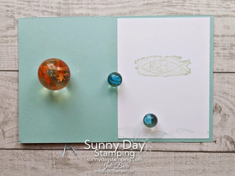
• Interior Cardstock Layer (Basic White): 4” x 5 ¼”
*Note: The supply list below includes the supplies to make the Teacup card. Supply lists for the other examples are later in the post. Keep scrolling!
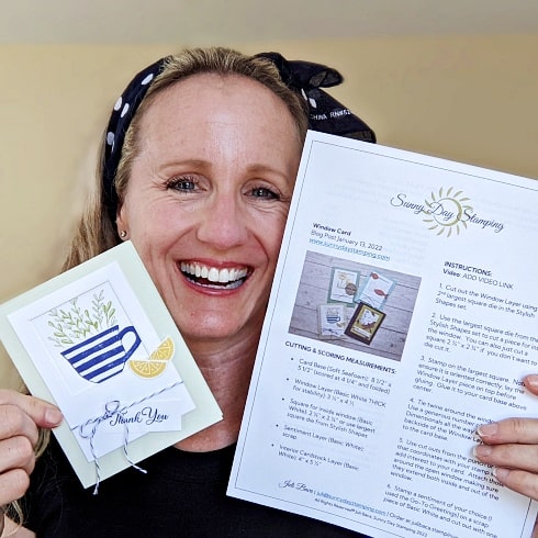
Use this same layout for pretty much any stamp set you have at home!
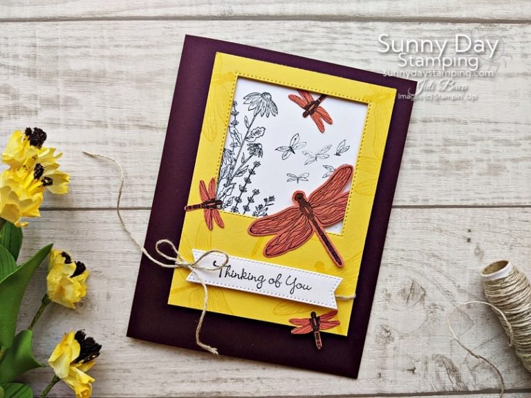
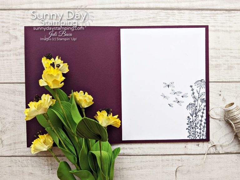
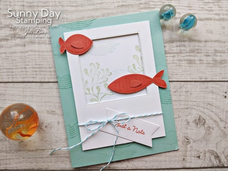
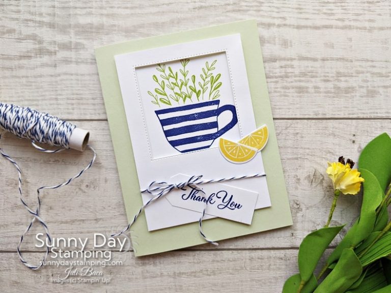
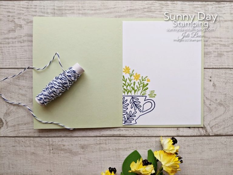
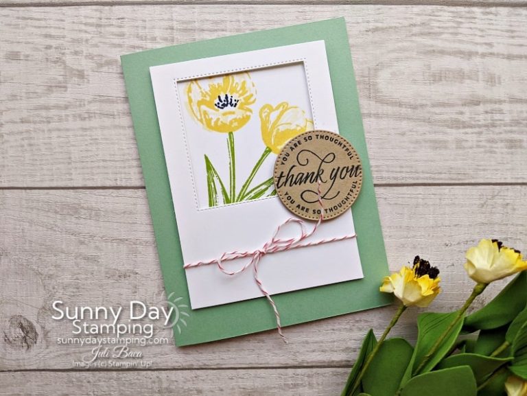
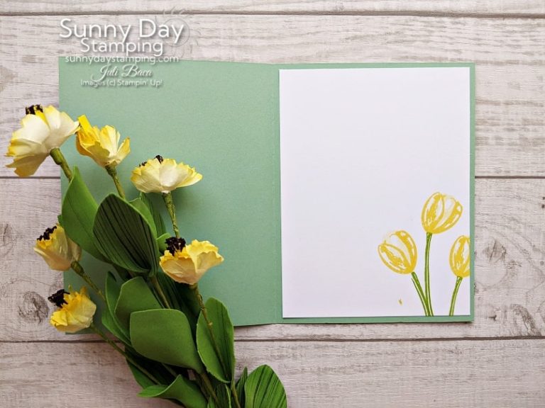
One easy way to add interest to your cards is to have elements extending past borders and edges.
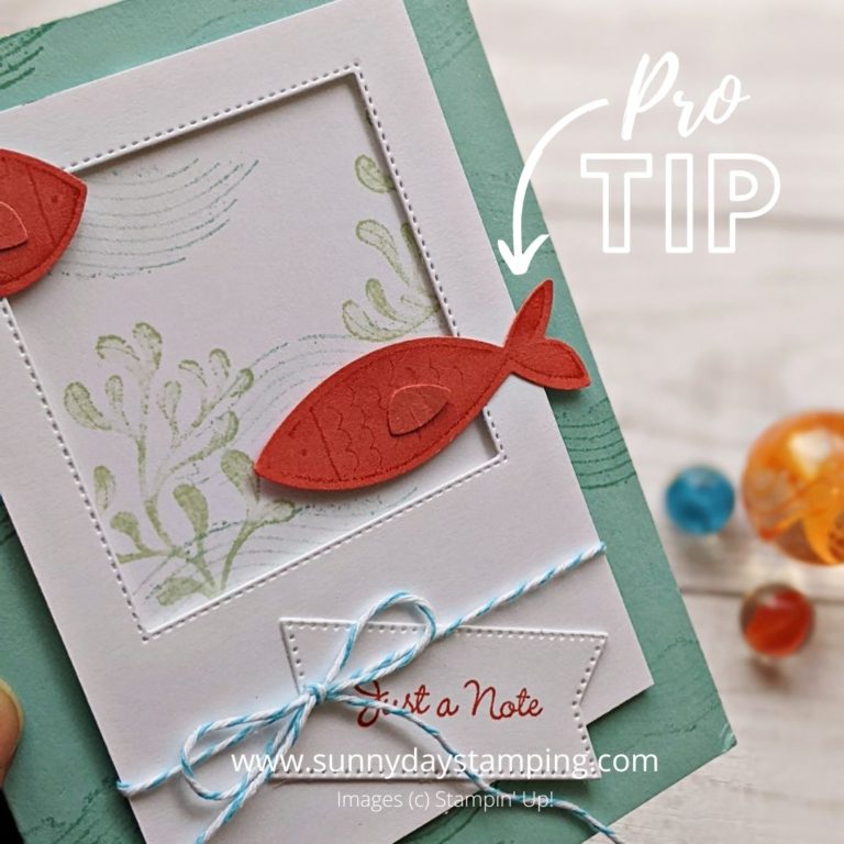
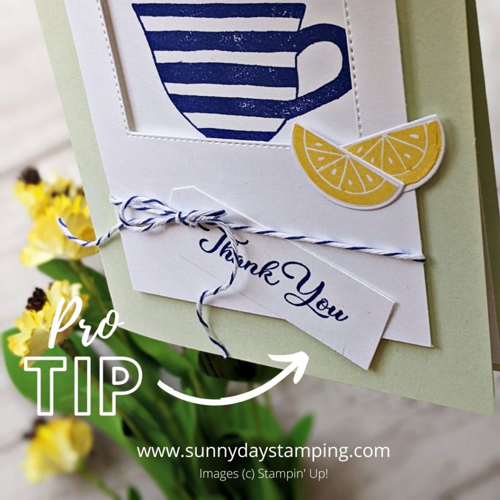
In the examples above, you can see that the stamped images are extending past the borders of the frame, the cut out images are hanging over the edge and both the ribbon and tag are breaking the boundaries! Instant WOW!